ART LYON: design, editing, writing, illustration, digital coloring, and other arcane secrets.

Posts tagged ‘DC Comics’

ALIGNMENT CHECK!

alignment

RPGaDay 2015

21st: Favorite RPG Setting


Another “I don’t have one”, maybe, but let me knock this around a bit…

As popular media settings go, I love playing supers games in the Marvel or maybe DC comic book universes, as long as there’s room to change things up a bit. I love Star Trek, especially the original series, and have played in or run quite a few Star Trek games, but none of them have lasted long. Star Wars has the big advantage of an easy buy-in, so I’ve played in and run that some.

I’ve done some games set in Middle-earth, and as a big Tolkien fan I’m always interested in that. 

I’ve played in a few of the D&D settings, but an Eberron war-forged is all I can remember.

See, I’m not a fan of pre-made worlds in general. Partly it’s the time and effort required to familiarize myself with a published setting – not just to read through but to really understand the flavor and tone of the setting. If I make up my own setting, I naturally have an innate sense of the details and tone, so I just find that a lot easier.

That’s the advantage of the popular media setting mentioned above: I know the tone, I know some or a lot of the details, and so do a lot of other people, so those settings have the advantage of an easy buy-in.

So…favorite? I guess I’d have to say “Middle-earth“. It has the combined familiarity of pseudo-medieval fantasy, Tolkien’s fiction, and the Lord of the Rings and the Hobbit film adaptation trilogies. Trouble is, Tolkien’s world is a pretty specific sub-genre, and in particular the way that magic works is pretty far afield from what players are used to in a standard fantasy rpg. Still, there’s a lot to like there, and Cubicle 7’s The One Ring, for example, does a good job of capturing the flavor of Tolkien’s stories.

Hmm…I may have to call this a tie, though, between Middle-earth and the Marvel universe.

Thing is, I don’t think I would want to do a lot of gaming in either setting unless the game experience was top-notch: invested players who are at least fairly familiar with the source material and tone, and a GM who knows how to capture that flavor and make it last.

MULTIVERSAL OVERDRIVE! – Justice League United #0

Multiversal-Overdrive-logo

The latest installment of MULTIVERSAL OVERDRIVE! is up, at the DC Entertainment fan-site DC Universe.

This time around, I review Earth 2 volume 1: The Gathering.

Go read it already!


MULTIVERSAL OVERDRIVE! – Justice League United #0

Multiversal-Overdrive-logo

I’ve started a new review column called MULTIVERSAL OVERDRIVE! over at  the DC Entertainment fan-site DC Universe.

You should go read it! All the time!

I started with a review of DC’s Justice League United #0, which I mostly liked. Check it out!


BRUCE WAYNE: GHOSTS OF GOTHAM

I’ve known Gene Ha and Lowell Francis for…well, let’s just say “a long time” and move on, before my lumbago starts acting up.  There was a stretch of a few years during which the three of us worked together developing ideas into presentable comic book pitches.  Many of these involved DC Comics characters,  because we all grew up reading comics, Gene had good relations at DC,  I had colored a bunch of Gene’s (and other people’s) work there, and Lowell had a lot of storytelling and editing cred.  (Eventually we all worked together on Project Superman, but that’s a story for another day.)

There were two ideas that reached a full pitch level, complete with conceptual art by Gene.  Lowell posted about Riddles: Edward Nigma, Consulting Detective (with comments and some of the illustrations) on his excellent gaming blog, Age of Ravens.  Riddles had a small cast of weird characters, and each issue was going to be an homage and send-up of traditional detective and pop-culture tropes and settings. It would have been a wild ride!  He also posted about the more recent, text-only pitch Lowell and I put together for a  revival of Warlord for DC’s “New 52” relaunch.  Those posts by Lowell and the news about Fox’s  upcoming “Gotham” tv series got me thinking about one of our pitches that hasn’t seen the light of day…

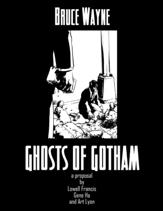
Of all the ideas the three of us pursued in depth, Bruce Wayne: Ghosts of Gotham was by far my favorite.  It would have been part of DC’s  “Elseworlds” imprint, an alternate take on existing DC Comics characters, their connections, situations, histories, motivations, modi operandi, etc.  I kind of fell in love it, I think because of the fun and challenge of working out all those differences and new connection, because it was our own little version of the DC universe, and because of the chance to make more interesting a some characters who I normally don’t have much affinity for.

Initially it was a broad, sweeping thing that included characters from across the DC universe, including Superman, Lex Luthor, the Legion of Doom, and many more.  There was a whole alternate Teen Titans idea in there somewhere. Because of the scale it started feeling a bit like Mark Waid and Alex Ross’ DC mini-series Kingdom Come.

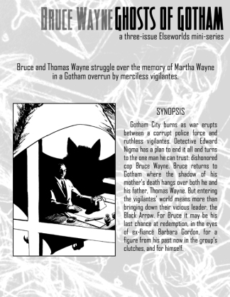
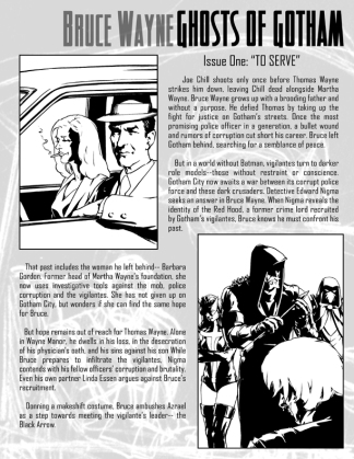
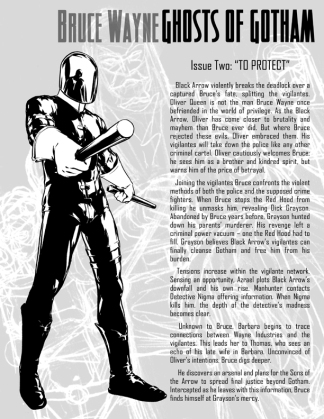
Eventually we wisely narrowed the focus to Batman’s usual stomping grounds, Gotham City, perhaps with the thought that we could explore the larger-scale ideas and implications in theoretical sequels.  Once we made that decision, the story really started to gel.  Lowell still loves our treatment of Edward Nigma (traditionally the real name of the classic Batman villain, The Riddler).  Once we started calling Green Arrow “Black Arrow”, I immediately thought of Robert Louis Stevenson’s The Black Arrow: A Tale of the Two Roses (a personal favorite of mine), and wanted to have his background and story arc mirror some of  things in that novel.

The basic premise of Ghosts of Gotham involved the ripple effects of one simple change to a seminal event in Bruce Wayne’s childhood:

Instead of the classic moment in Batman’s “origin story” when a random thug with a gun senselessly murders Bruce’s parents before his eyes – setting Bruce on a disciplined path of revenge, justice, and a war on crime – in “Ghosts of Gotham” Bruce’s mother alone was shot and killed, and his father proceeds to beat the thug to death with a brick – as Bruce watches on in horror.

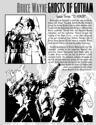
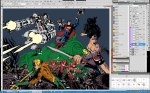
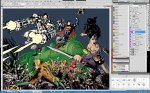
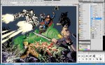
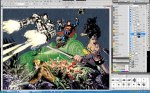
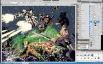
But I should let the pitch speak for itself.  These are the actual full pages of the proposal we presented, so you’re seeing what the folks at DC saw.  Text by Lowell, art by Gene, layout by me.  I have no idea how I would have colored this comic at the time, had it come to that.  Looking at it now, I would approach it very, very simply, since Gene was using a lot of blacks.  The background images behind the text are taken from Gene’s rough sketches.

Click on the thumbnails below for bigger, readable versions.

GoG cover GoG p1 GoG p2 GoG p3 GoG p4

Sadly, aside from any story problems that might exist, there were two sort of editorial problems that kept this idea from going to any next stage:

1. Apparently, in an Elseworlds story about Bruce Wayne, by the end of the story someone has to put on a Bat-costume of some kind.  It’s a rule or something.  I think we just didn’t want to force the whole bat-thing, and kind of wanted to explore a Gotham that didn’t have that.  Oddly enough, our original, larger-scale idea would have not been so focused on Bruce Wayne and would have gotten around that.

2. By the time we presented the idea, DC was kind of done doing Elseworlds stories, but hadn’t made a point of it publicly.  They were trying to refocus their brand, which eventually led to The New 52 version of the DC universe.

So, there you have it.  I still have the crazy dream of using this idea – or something stemming from the same altered turning-point – as the setting  for a role-playing game with friends some day.

VILLAINS MONTH! Superman 23.2 and Action Comics #23.2!


This week – today, even! – you can find these two lovely items at your local comic book store. I colored them, from Gene Ha’s mighty pencils and inks. Published by DC Comics.

All of DC’s “New 52” comics this month are part of their “Villains Month” event, wherein all the comics in September feature stories focusing on villains common to each respective title – and ALL of them have 3-D covers! ALL OF THEM! This is a massive undertaking, and I commend DC on their bravery and glorious insanity!

3-D covers are quite complicated to produce, as you might imagine – both from an illustration and a production/printing viewpoint. Gene produced 3 illustrations for each cover with different dimensions and proportions than for a regular cover. I needed to assemble and color each illustration and provide DC’s production department with three separate, finished files for each cover. In a normal 2-D illustration you would not see things that are behind something closer to the viewer, but in 3-D you can sort of see behind objects, so that normally-hidden stuff has to be there as finished art.

Below you will see the three layers of line art Gene so magnificently produced. For Superman 23.2 I provided DC’s production department with two options: one with a colored background and one with a mostly white background. There was some confusion about how to execute these covers, I guess, and at one point near my completion of the Superman cover I was informed that the backgrounds needed to be white. So, I gave them both and let them work it out.

I finished the Action cover after I was informed of this white background thing, and luckily I had planned on making the background very light and minimal anyway, so I just went even further in that direction with it. I wasn’t happy with the background, but I thought it was what they wanted.

I guess there was some communication break-down or change of plans, because a different background was added. generally I’d say it looks better this way, although the color choices are too similar to the foreground and middle-ground colors, which kind of mitigates the “pop” of those colors. Of course, in 3-D getting the colors to “pop” is maybe not so big a deal.

I should stress that I don’t fault anyone at DC for any of the confusion involved. It’s a minor miracle that any comic gets into your hands without errors or mis-steps, there are so many things that can go wrong. This is why I bow before the good people in the industry’s production departments.

Go check out the covers this month – they are super-snazzy!


Coloring Presentation at 12-Hour Comic Book Day

On July 27th, 2013, the Monroe County Public Library in Bloomington, Indiana (where I live and breath) held it’s 6th annual 12-Hour Comic Book Day. Each year, young women and men between the ages of 10 and 20 write and illustrate comics of their own creation within a time limit of twelve consecutive hours.  MCPL’s Children’s and Teen Services teamed with our local comic book store,  Vintage Phoenix Comics, and provided art supplies, food, and surprises – like me! Prizes were awarded for every three hours of comics-making. Participants can work individually or collaboratively. Many of the resultant comics can be seen at the event’s Flickr site, here.  My kids and I are in photos 2-6!  My son created “Evil Limbs” and “Punch Me“, and my daughter whipped up “Aliens Attack!” and “Party Pooper”.

Those two pictures of me are from the presentation I did for the kids about comic book coloring.  I don’t know why I never contacted anyone about the event in previous years, but this year I did – albeit with little time to spare.  I figured most kids would know about the Justice League or at least some of that teams members, so I opened up the full, working file for Justice League #20 (written by Geoff Johns and published by DC Comics) pages 4&5 and got to work.  Those 2 pages are a 2-page spread of the JL battling some toothy, ravenous, mindless minions, but it had a lot of special effects and I thought it would be a good, big, simple way to show the layers of work involved in coloring a modern, mainstream super-hero comic book. I talked through each layer of art, from the initial black-and-white line art to the last streaks of rain. The kids were adorably and goofy and awkward and smart. They had good questions, and a couple of them hung around after my presentation to ask even more smart questions.

There are articles about the event here and here and here. Thanks to Chris Hosler of MCPL’s Adult and Teen Services for being friendly, helpful, and in charge!

Here are the images I used in the presentation. Click on the first one and then just click through the slideshow!

MAN OF STEEL movie chat with The Raging Bullets!

Sean Whelan and Jim Segulin host a DC Comics fan podcast called The Raging Bullets. If you like comics, you should totally give it a try. They go on at geeky lengths to discuss comics and comics-related media, always in a positive light.

I’ve been on the show several times to talk about my work as a colorist and comics in general, and about the Smallville tv series back when it was on. We were making arrangements to talk again, and I realized our plans coincided with the release of Man of Steel, so I kind of begged to be part of their inevitable discussion about the film.

Feast your ears!

http://ragingbullets.com/2013/07/19/episode-358-is-here-epic-man-of-steel-chat-with-art-lyon/

THE SHADE #12

THE SHADE #12, by James Robinson, Gene Ha, me!, and Todd Klein. Edited by Wil Moss. Published by DC Comics, release date September 12th, 2012.

Gene Ha and I seem to be on a roll. I can’t express how much I appreciate the advantage of working with Gene. Let’s put aside for the moment the advantages of working with a friend and highly-talented penciller/inker. To get the level of detail and realism we all know and love him for, lately Gene’s been getting gigs that consist of one or maybe two issues. Perhaps out of a lack of confidence, I tend to approach each new project (be it a single issue or series or graphic novel) as if I’ve never colored a comic before. These two forces combine when I work with Gene, such that I can really just rethink how I do things on nearly every project Gene and I do together, and I’ve been doing this more and more lately. It can be maddening and time-consuming, but liberating as well. Re-inventing my approach requires experimentation, and that takes time, but the results seem to be making people happy and it pays some of the bills and I can usually look at the final, printed product and be happy with much of it, so yay, us!

So, since this issue is nearly all flashbacks to 1838, Gene wanted a moody paper texture worked into the art. We had done something similar on an early, unpublished cover for Project Superman, but this was the first time I had incorporated a paper texture into my coloring on a whole issue. I took advantage of this texture to help make characters and items stand out on the page or in a panel, by lessening the texture in those areas. This has the effect of making the black line art and the colors themselves stand out more than then other areas with more texture over them, and voila: a hopefully subtle 3-D effect.

Gene also said he wanted subdued colors, and referenced our muted palette on TOP 10: THE FORTY-NINERS as an example. If I had a time-machine, I would go back and make my work on TOP 10 about 10 times better, but this was my chance to give that look another whack. The colors here are generally more saturated and more focused on the mood of a scene than most of what I did on THE FORTY-NINERS. My initial instincts as a colorist back then were to go for bright, bold colors, but for most of what I was doing at the start of my career I had to tone that way down. In the last couple-few years I’ve had to train myself to punch things up. Working on Justice league #7 and Action Comics #3 and #9 really helped with that.

I think I could have done more with the shadow-spirits in the climax, maybe by adding some highlights or “reverse shadows” to make them seem more three-dimensional. I’m fascinated by how many different ways there are to give a two-dimensional image a sense of real depth, so I’m always looking for new ways to do that.

James Robinson talks about his work on The Shade and has very nice things to say about the work Gene and I did in an interview over at Comic Book Resources.

Doug Zawisza gave the whole thing a bunch of stars in his review at CBR.

ART! History lesson #1: TOP TEN: THE FORTY-NINERS!

TOP TEN: THE FORTY-NINERS

A 96-page graphic novel by Alan Moore, Gene Ha, Art Lyon, Ellen Starr Lyon, and Todd Klein, published in 2005 by Wildstorm Publications as part their “America’s Best Comics” line. Go buy it now!

THE FORTY-NINERS is wanted for murder! It killed two of my monitors. One of them died as I was uploading the last pages to Wildstorm – I had to call my editor Scott Dunbier to make sure the files got there, because I couldn’t see anything on my computer to check it myself!

Gene introduced me to comic book colorist exemplar Alex Sinclair at the 2001 San Diego Comicon. We got a tour of Wildstorm’s offices. Unbeknownst to me at the time (mostly because I’m dense), Gene already had it in his head to make me into a colorist. Silly Gene!

Around the end of 2002, I started coloring THE FORTY-NINERS. I had taken a Photoshop class in 1993, and by 2002 I was using it for cover design at a print-on-demand publisher. I was tragically bored at that dreary, dreary office job, and I quit in 2003, foolishly assuming that coloring was some sort of real job. On Monday, August 4th of that year, I started my life as a “full-time” professional comic book colorist. I sat down at the computer after breakfast, and stopped for lunch on the back deck with my wife Ellen and one year-old son. I picked blueberries in the back yard for our dessert. Life is good.

To the right is the first bit of conceptual art I got from Gene, and possibly the first thing I had colored–albeit very simply–since 1994 (for a comic called Exile Earth, but more on that later).

Below is the image I put together for the stamp seen on the box containing Leni’s Besensteil on page 20. It’s the old Comics Code Authority seal of approval – in German! We comic artists love our visual jokes and homages.

Unfairly uncredited in the book is my wife Ellen Starr Lyon. Ellen is a very talented oil painter, and she wrestled with watercolors for the sake of moving the pages along at a quicker pace, laying down some background and character ink-washes.  I discussed her being credited with me as a colorist very early on in the process, and I guess I assumed that was all settled, and forgot about it. When the hardcover edition was published and I saw her name was not there, I pointed it out but clearly didn’t put a fine enough point on it, because her name is also not in the trade paperback edition. Grrr. I’m going to see what I can do about future editions.

So, clearly I had almost no idea what I was doing on this book, both as a colorist and as a professional. I mean, colored a third of it on a 13″ monitor with a mouse! Yeesh.

Even my amateur sensibilities and lack of know-how couldn’t ruin another Moore/Ha masterpiece, though: it won the Eisner award for 2005’s Best Graphic Album (New). I went to the 2006 San Diego Comicon despite the expense, and wound up viewing the awards ceremony with the audience rather than sitting at the guest/nominees tables because I wasn’t on the stupid guest list–though technically I wasn’t nominated. That’s what I get for not being more assertive: I missed out on the guests-only dinner tables and had to settle for the audience’s finger-food buffet of weak-sauced meatballs and bread!

Did I mention this thing took about 2 years to finish? Because it did.

I think I got the hang of it about half way through–just in time for the vampire brothel sequence!


Tag Cloud

Citizen Dame

The intersection of filmdom and feminism

ceci says

did I just say that? (adventures in stream-of-consciousness writing)